
Use Board Studio’s Links section for visual dependency management: reveal blockers, control which Jira issue links appear, and make their direction and meaning easy to read. Each link type row combines two actions:
- Visibility controls define which outward and inward links are displayed.
- The pencil button opens the editor that defines how the link looks.
For the planning view behind these controls, see how Board Studio builds an interactive Jira dependency graph across projects and hierarchy levels.
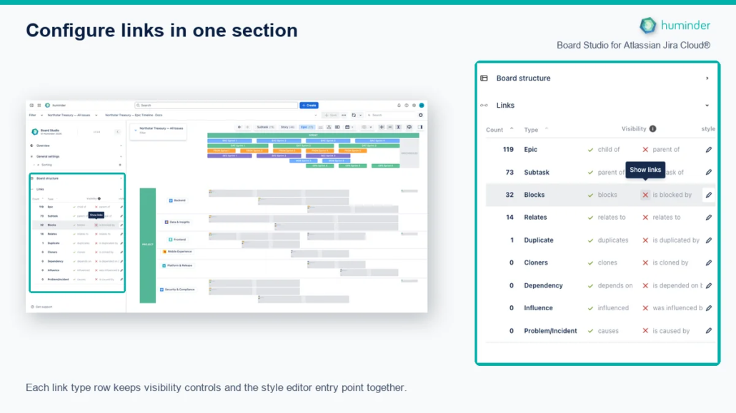
Each link type row keeps visibility controls and the style editor entry point together.
Link type rows
The Links section presents every link type as a row. The controls you need to display or style a link are placed directly on that row, so you can identify the link type before changing it.
| Row control | What it does |
|---|---|
| First visibility control | Show or hide the outward direction |
| Second visibility control | Show or hide the inward direction |
| Pencil button | Open the style editor for that link type |
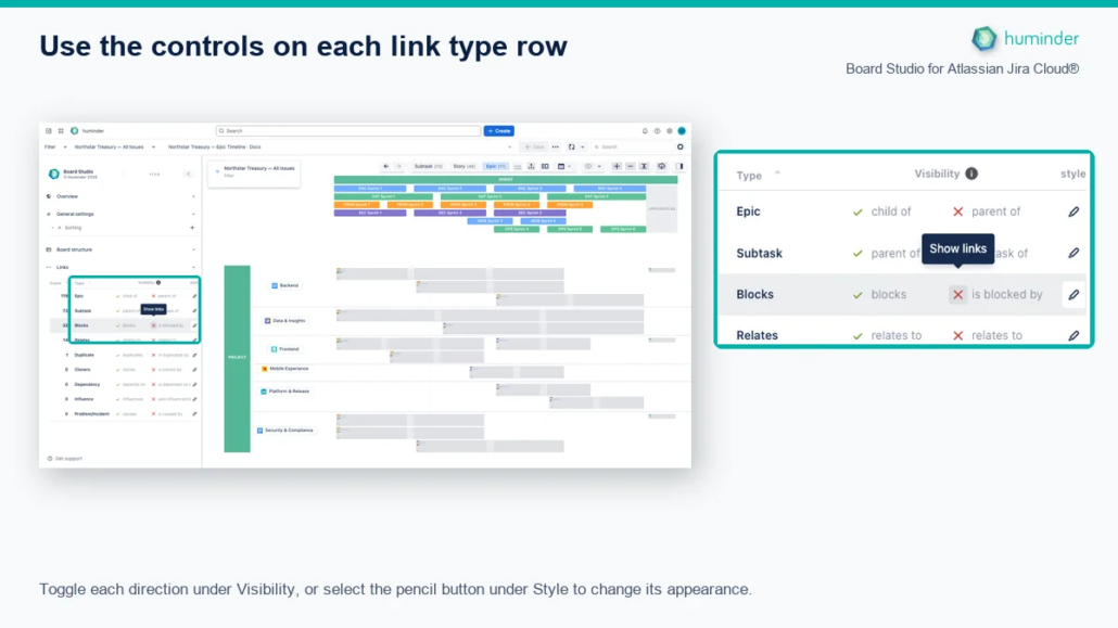
Toggle each direction under Visibility, or select the pencil button under Style to change its appearance.
The green check and red cross are buttons, not status labels. Select either one to change that direction independently. Select the pencil button at the right of the same row to edit its visual style.
Style editor
The Style editor lets you configure the visual appearance of every link type in your Jira instance. Board Studio fetches all available link types directly from Jira (via /rest/api/3/issueLinkType), so you can set up your preferred styling before you load a data source. Select the pencil button on the relevant link type row to begin.
What you see
The editor opens for the selected link type and shows separate SVG previews for the outward and inward directions.
Outward vs. Inward directions
Every Jira link type has two directions. Board Studio lets you style each direction independently so you can visually distinguish link semantics at a glance.
| Direction | Meaning | Example (“Blocks”) |
|---|---|---|
| Outward | This issue acts on another | “blocks” |
| Inward | Another issue acts on this one | “is blocked by” |
Tip: Use a solid line for outward links and a dashed line for inward links to make dependency direction instantly recognizable.
Style properties
Select the pencil button on any link type row to open the Style Editor modal.
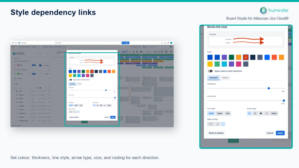
Set colour, thickness, line style, arrow type, size, and routing for each direction.
The following properties are available per direction:
| Property | Range / Options | Description |
|---|---|---|
| Thickness | 1 to 6 px | Line weight. Thicker lines draw attention to critical dependency types. |
| Line style | Solid · Dashed · Dotted | Line pattern. Combine with direction to encode outward vs. inward. |
| Arrow type | Triangle · Circle · Circle-filled · Diamond · None | Arrowhead shape at the target end of the link. |
| Arrow size | 0.5 to 3.0× (step 0.1) | Scale factor for the arrowhead relative to line thickness. |
| Colour | Theme-aware palette | Colours that adapt to light and dark mode automatically. |
| Routing style | Orthogonal · Octilinear · Curved | Edge path geometry. Orthogonal uses right-angle bends; Octilinear adds 45° segments; Curved produces smooth splines. |
Editing workflow
- Select the pencil button next to the link type you want to edit.
- The Style Editor modal opens, defaulting to the Outward tab.
- Adjust any combination of properties. The live SVG preview updates in real time as you change values.
- Switch to the Inward tab to configure the opposite direction independently.
- Optionally enable Link both directions to apply the same style to both outward and inward.
- Click Apply to commit your changes, or Cancel to discard them.
| Action | What happens |
|---|---|
| Apply | Saves styles to the configuration. Edges on the board update immediately. |
| Cancel | Discards all changes and reverts the preview to the previously saved style. |
| Reset to default | Restores the factory default style for the selected link type. |
Note: Board Studio provides sensible default styles out of the box, with solid outward lines and dashed inward lines, standard thickness, and filled arrows. You only need to customise them if you want a different look.
Display controls
The Display controls show link types that have been discovered in the currently loaded issues. Unlike the Style editor, which is available for all Jira link types, these controls only show types that are actually present in your data.
What you see
Each discovered link type appears as a row with visibility toggles, a count badge, and separate outward/inward controls.
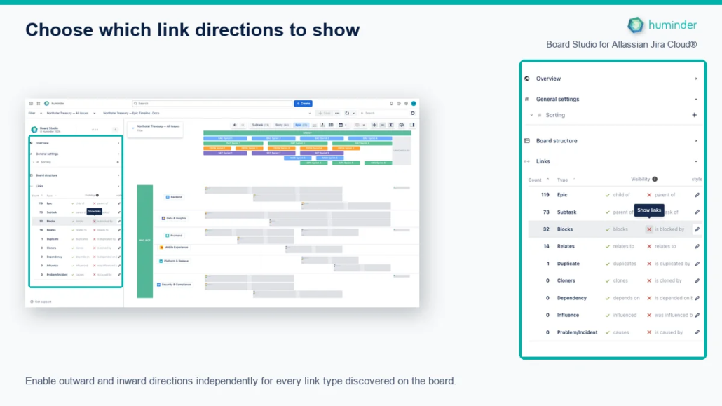
Show or hide the outward and inward direction independently for every discovered Jira link type.
The first direction is outward and the second is inward. A green check means that direction is shown; a red cross means it is hidden. Click either control to change only that direction for that link type. For example, you can show blocks while hiding is blocked by.
Controls
| Control | Description |
|---|---|
| Outward toggle | Show or hide outward links of this type |
| Inward toggle | Show or hide inward links of this type |
| Count badge | Number of links of this type found in the loaded data |
| Sort selector | Sort the list by Count (highest first) or Name (alphabetical) |
| Bulk show / hide | Toggle all link types on or off at once |
Visibility behaviour
When you hide a link type:
- Edges disappear from the board instantly. No re-layout occurs.
- Focus mode excludes hidden link types. Navigating dependencies skips them.
- Card link indicators update to reflect only visible links.
Tip: Hide non-critical link types (e.g., “Relates to”) to reduce visual clutter and focus on blocking dependencies.
Link type reference
Board Studio supports all standard Jira link types. Here are the most common ones:
| Jira link type | Outward label | Inward label |
|---|---|---|
| Blocks | “blocks” | “is blocked by” |
| Clones | “clones” | “is cloned by” |
| Relates | “relates to” | “relates to” |
| Duplicate | “duplicates” | “is duplicated by” |
| Parent / Child | “is parent of” | “is child of” |
Custom link types created in your Jira instance are supported automatically. They are available to both the Style editor and Display controls.
Advanced edge behaviours
Live edge updates
Style changes are applied to edges immediately without triggering a board re-layout. The rendering engine updates edge visuals in place, preserving the positions of all cards and swimlanes.
When you select Apply, Board Studio saves the configuration, notifies the graph, and redraws the affected edges. No page reload or card movement is required.
Professional-grade edge routing
Board Studio routes edges cleanly around cards. Edges never pass through issue cards. Bends adjust automatically when cards move or resize, ensuring a clean, readable dependency map.
Collapsed group edge aggregation
When groups are collapsed on the board, individual edges between group members are replaced by a single aggregated edge between the collapsed groups. The aggregated edge displays a label showing the count of underlying links by type.
Dependency roll-ups
In real-world programmes, the dependencies that matter, such as “this Epic blocks that Epic”, almost never exist as direct Epic-to-Epic links in Jira. They live as Story-to-Story or Sub-task-to-Sub-task links, several levels below where leadership needs to see them. Dependency roll-ups solve that.
When you turn the toggle on, Board Studio synthesises a single aggregate edge between two ancestors at the current zoom level for every set of underlying child links connecting their descendants. The aggregate edge is rendered as a distinctive triple-line style, with thickness and a numeric count badge that scale with the number of underlying child links. This makes your programme’s dependency hubs visible at a glance.
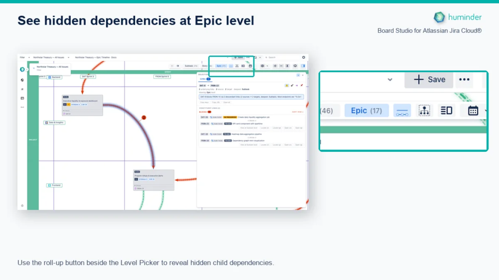
Use the roll-up button beside the Level Picker to reveal hidden child dependencies.
How to turn it on
| Step | Action |
|---|---|
| 1 | Go to the hierarchy level where you want to see aggregate dependencies. |
| 2 | Click Show links rolled up from child items beside the Level Picker. |
| 3 | The board re-renders with aggregate edges at the current hierarchy level. |
Click the same button again to hide rolled-up links.
Tip: Roll-ups are particularly powerful at the Epic level. They reveal cross-team dependency hubs that would otherwise require correlating dozens of separate Story-level links.
Anatomy of an aggregate edge
| Visual | Meaning |
|---|---|
| Triple-line style | Distinguishes a synthetic, rolled-up edge from a direct Jira link. |
| Thickness | Scales with the number of underlying child links. |
| Numeric count badge | Displays the exact number of underlying links (e.g. “7”). |
| Source / target | Always two ancestors at the current zoom level. The underlying links connect their descendants. |
| Colour and line pattern | Inherited from the link-type style. If multiple link types contribute, the dominant type’s style is used. |
Drilling into a rolled-up edge
Aggregate edges are clickable. Selecting one opens the Inspector on its Links tab, which explains the dependency end-to-end:
- A plain-English summary banner at the top.
- Depth chips to filter constituents by descendant level (e.g. Stories only).
- A risk-sorted list of the underlying child links with status lozenges, risk badges, and one-click Locate / Open / Copy keys / Copy JQL actions.
- Pin the edge for later comparison. The Pin Tray holds up to 3 items.
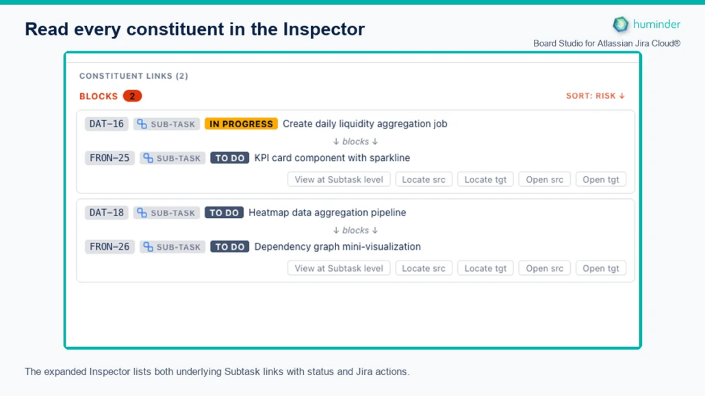
The expanded Inspector lists both underlying Subtask links with status and Jira actions.
Roll-ups and semantic zoom
Roll-ups are recomputed automatically as you change hierarchy level:
- At Epic level, an aggregate edge represents the sum of all Story- and Sub-task-level links between two Epics’ descendants.
- At Story level, an aggregate edge represents the sum of all Sub-task-level links between two Stories’ descendants.
- At Sub-task level, no roll-up is needed. Links are shown as direct edges.
The Inspector’s pinned edges and selection are preserved across zoom changes; the panel re-anchors to the new level instead of disappearing.
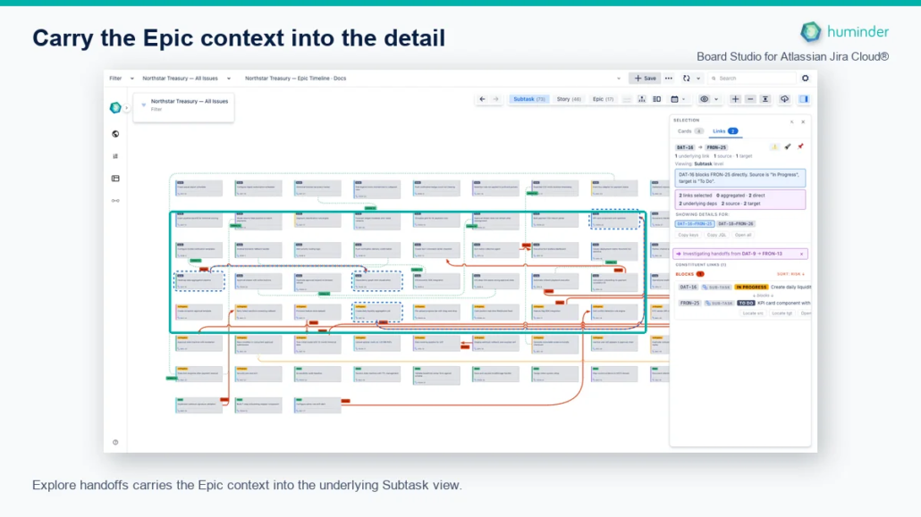
Explore handoffs carries the Epic context into the underlying Subtask view.
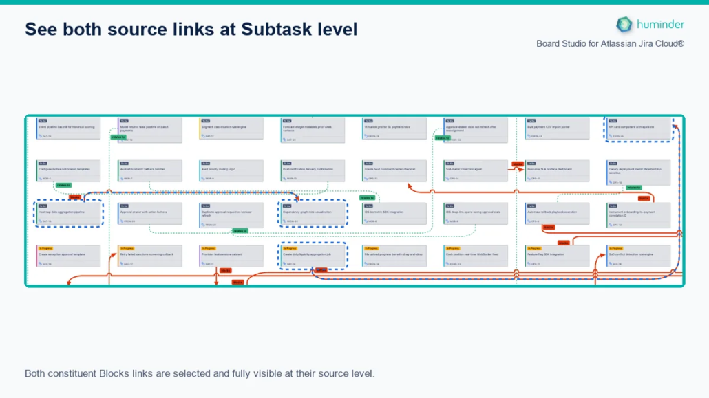
Both constituent Blocks links are selected and fully visible at their source level.
Why it matters
| Pain point | How roll-ups solve it |
|---|---|
| Story-level dependencies are invisible at Epic level, so leadership has no way to see cross-team risk in one view | One Epic-to-Epic aggregate edge per dependency cluster, thickness and count badge encoding magnitude. |
| Manually correlating dozens of separate Jira links to assemble a dependency map | Roll-ups synthesise the map automatically from the underlying child links. |
| Finding which underlying stories cause a given inter-Epic dependency takes 5+ clicks across Jira tabs | Click the aggregate edge → Inspector explains it with a one-line summary, risk-sorted constituents, and one-click Locate / Open / Copy actions. |
| Other tools surface dependencies only in tables or Gantts, not on a hierarchy-aware spatial board | Roll-ups render as proper edges on your board, integrated with link styling, focus mode, and the Inspector. |
Tips and best practices
| Tip | Details |
|---|---|
| Encode direction visually | Use solid lines for outward and dashed for inward to make dependency flow obvious. |
| Use colour to categorise | Assign distinct colours to “Blocks” vs. “Relates to” so critical dependencies stand out. |
| Hide noise | Turn off “Relates to” or “Clones” in Display to focus on blocking dependencies. |
| Style before loading data | Pre-configure your preferred link styles in the Style editor before selecting a data source. |
| Try different routing styles | Use Curved routing for dense boards. Smooth splines are easier to follow than sharp bends. |